LOGO and BRAND IDENTITY of
This project was developed in collaboration with a Digital Мarketing Agency MARKCEPTION.
INTERVAL is a Digital Marketing Agency that was formed by merging two other agencies with identical activities - Markception and Interval.
Mission - To create a logo and brand identity that unites the elements of already existing brand ideologies.
LOGO - The interval as a sign and word is associated with a distance - from exact A to point B. To cover the distance from the start of your business to the achievement of the set goals, trust Digital Marketing Agency INTERVAL. The spelling of the name is not coincidentally inside the space itself. In this way, the importance of the company is further emphasized and strengthened.
The elements I had to develop for the brand identity:
- Logo;
- Typography:
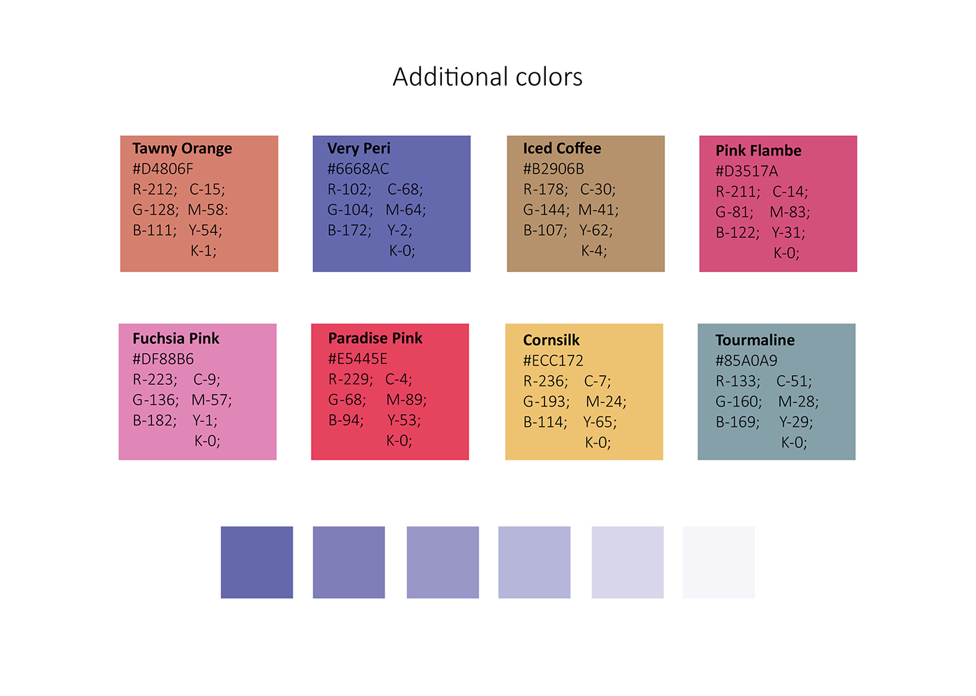
- Color palette;
- Brand elements;
- Brand book.
The overall design is my idea and development. I worked with the following programs: Adobe Illustrator, Adobe Photoshop, for the preparation of a brand book - Adobe InDesign.